
Fintech
Goalsetter
A family fintech app, rebuilt as a system.
- Project scope
- UI/UX · Product
- Industry
- Fintech
- Role
- Product Designer
- Services
- Product Design, Design Systems, UX Research

Project overview
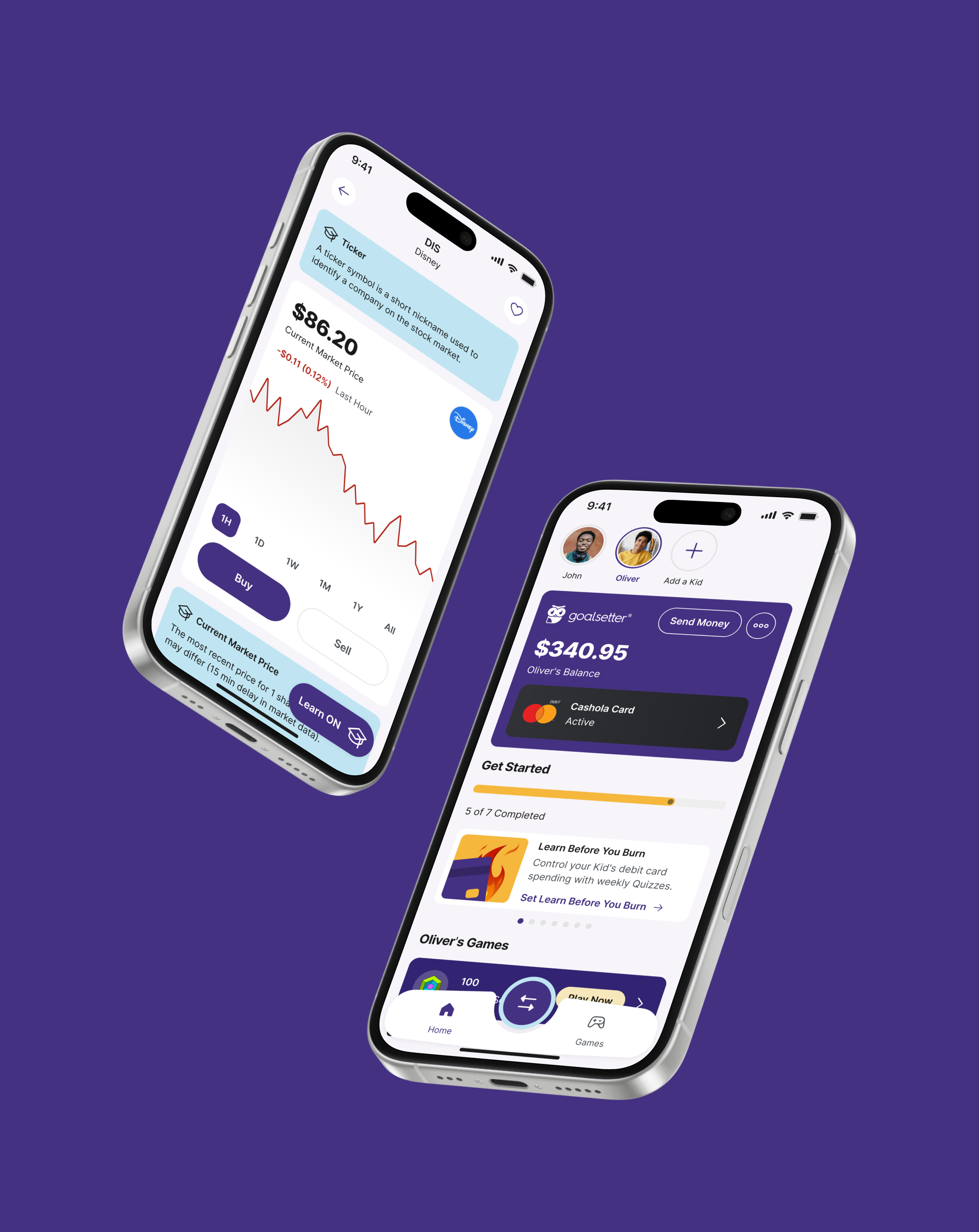
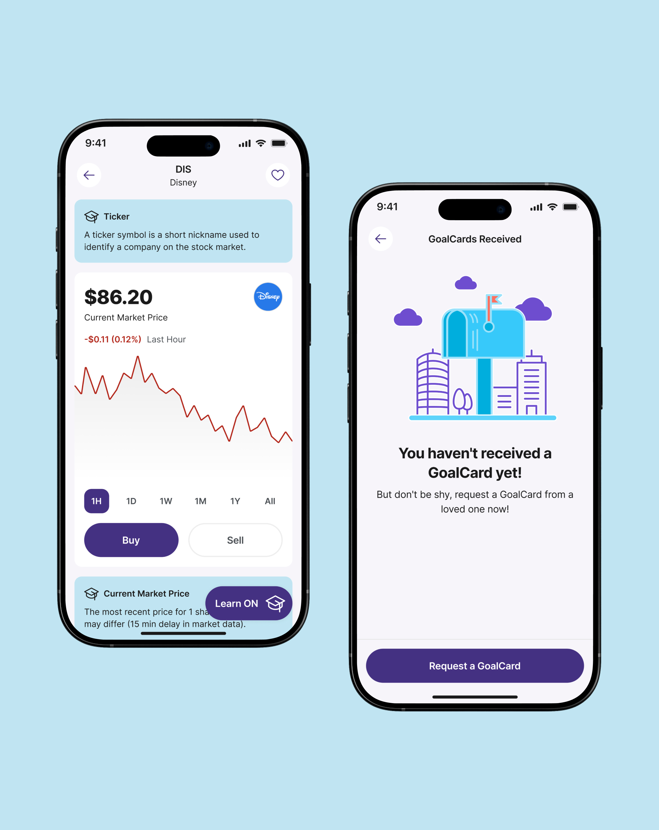
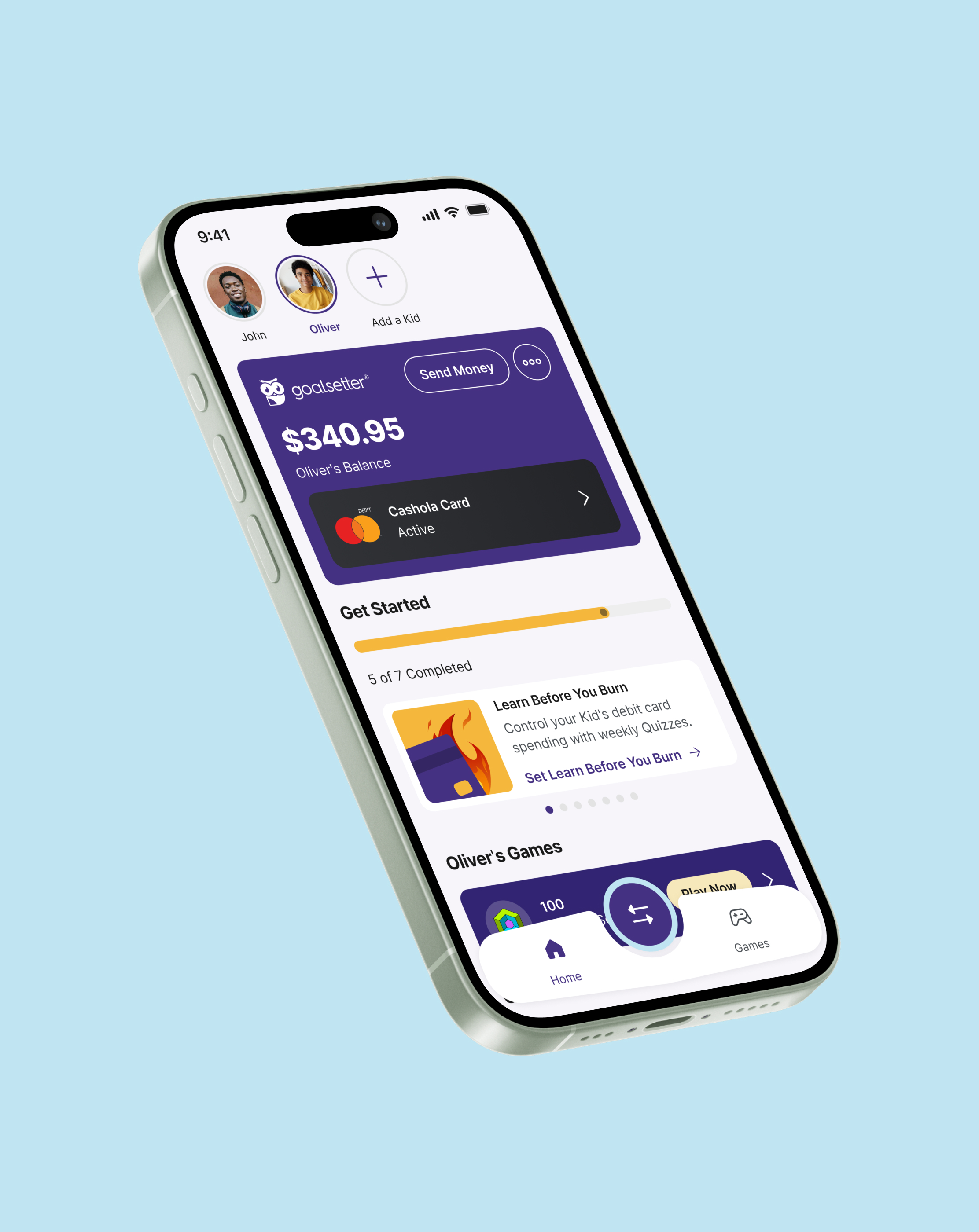
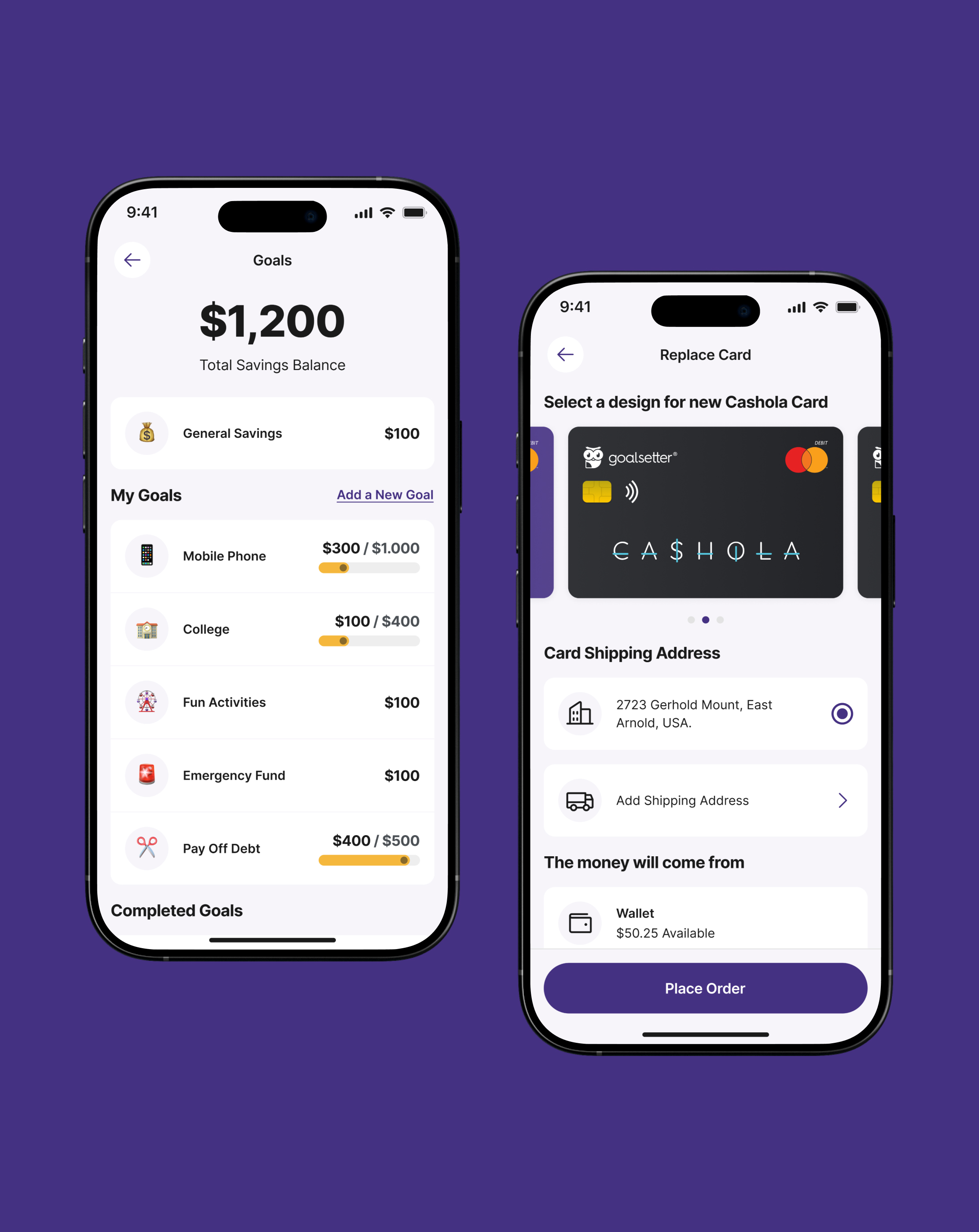
Goalsetter is a fintech mobile app for the whole family. A parent can keep money in a wallet and spend it with a debit card, put it in a savings account by creating goals, or invest it in their favorite companies. Kids can use the same features. The aim is that while the family uses the app, they also learn financial education.
We joined a product that was already live, with real users, and no design system. Screens were designed one by one, so the interface pulled apart as the roadmap grew. With engineering, we proposed a scalable system we could apply feature by feature, using research on each flow to fix the experience, not only restyle it.
Objective
- Create a scalable design system for an app that was already live.
- Apply it feature by feature, and use research to fix the experience on each flow.
- Give engineering a complete handoff, including error, pending, and loading states.
Results
- +32% onboarding completion after we split signup into smaller flows.
- +40% faster to design new screens with a reusable system.
- +30% faster to build new screens with the system in Storybook.
The challenge
A live app with no shared language.
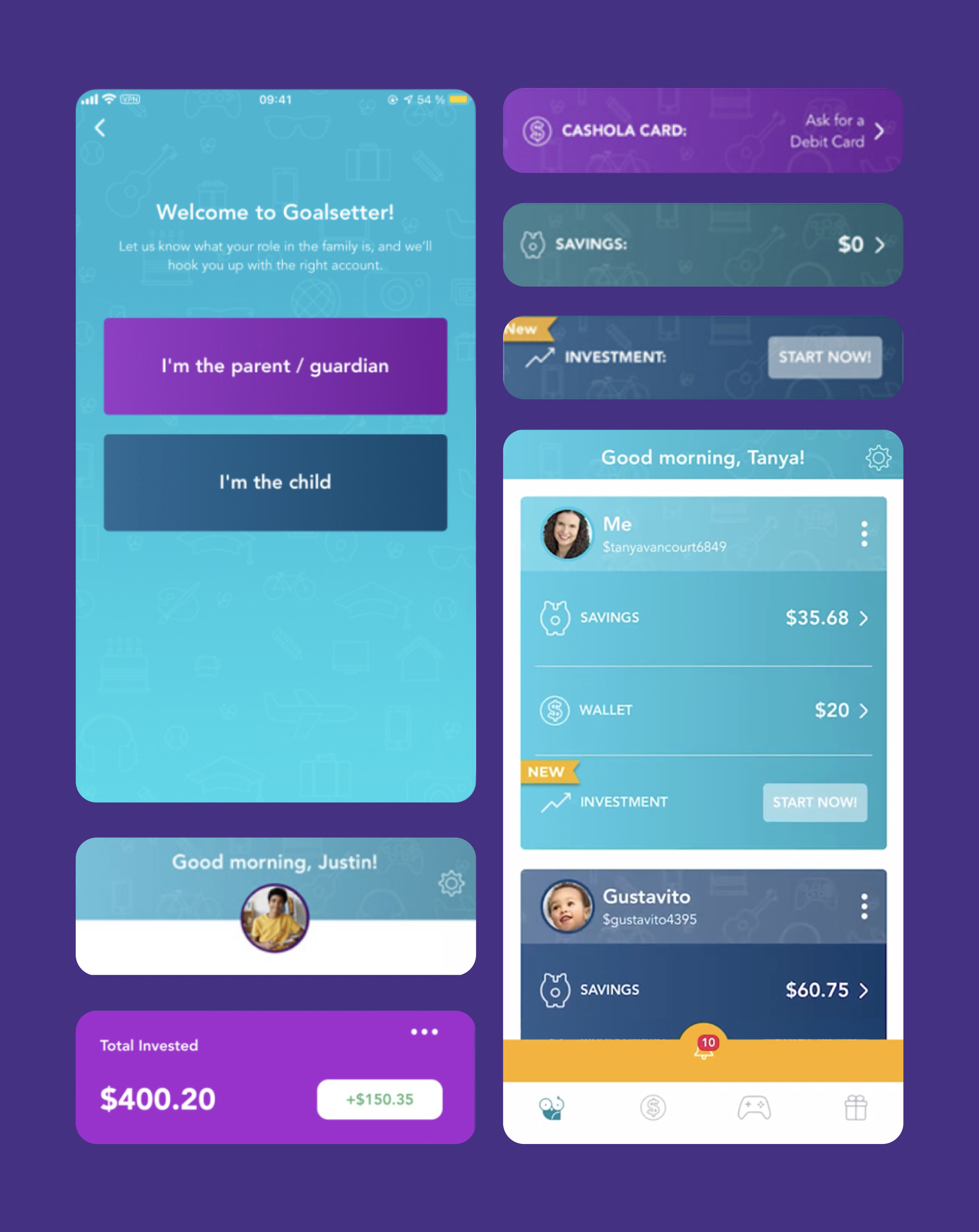
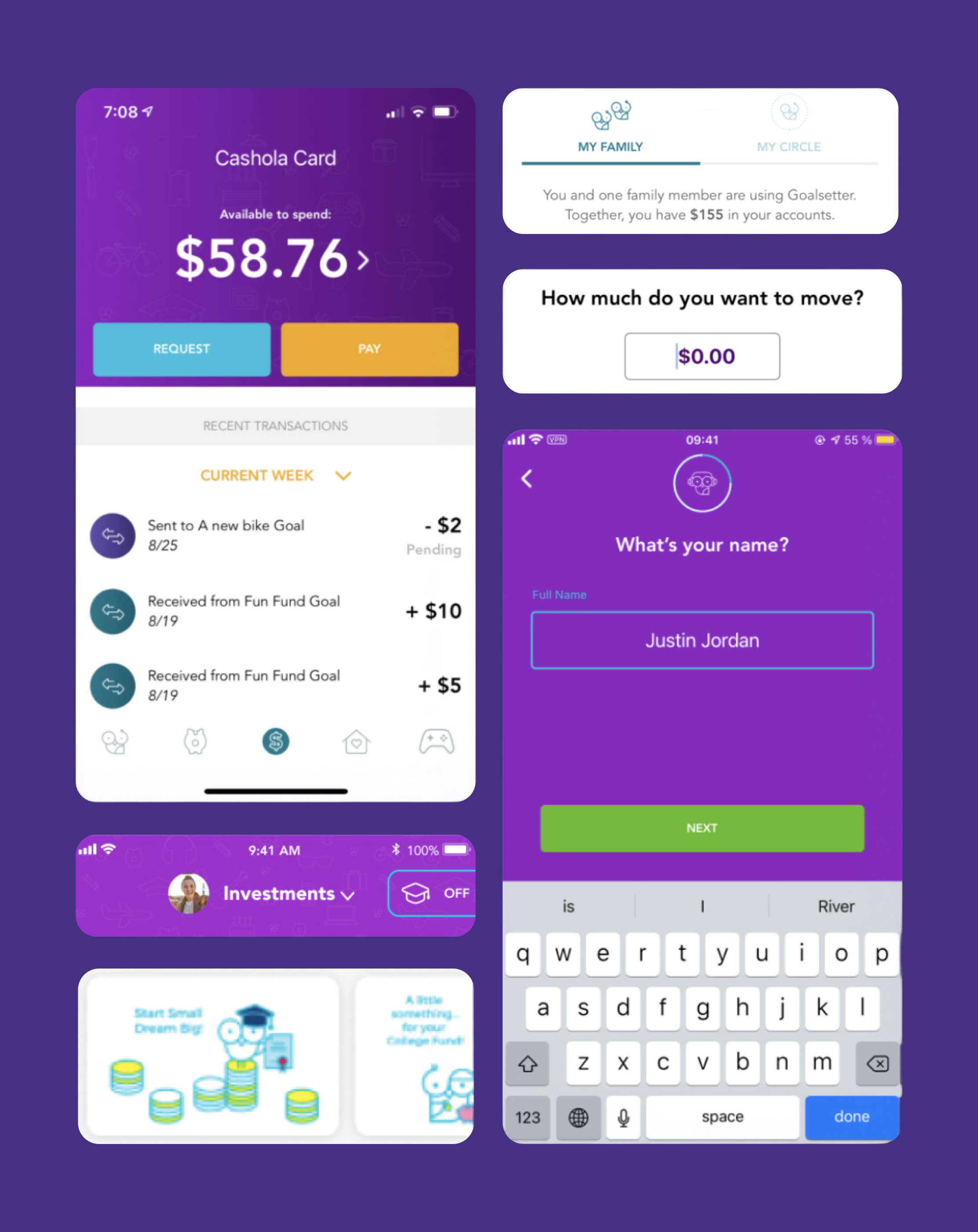
The company already had an end-to-end app in production. There was no design system, so every new feature arrived as a one-off. Type, spacing, and components looked different from screen to screen. Families dropped out of onboarding because it was long and asked for a lot of personal data before they had even entered the app. After the first child was added, Add a Kid sat at the bottom of a long dashboard scroll. Parents also could not tell which account was tied to the debit card. If they misread that, a kid could go to pay and the card would decline. Accessibility was thin. Engineering was filling gaps design had not handed over.
Discovery
What we heard.
We started from research the company already had, then added interviews, email surveys, and password-protected Figma prototypes. These findings shaped the system and the first flows we put it on.
Qualitative
Key flows
01
Onboarding asked for too much personal data too soon, so families dropped off before they reached the product.
02
After adding a first child in onboarding, parents could not find how to add another. Add a Kid sat at the bottom of a long dashboard scroll.
03
Parents did not understand which account was tied to the debit card, so a child could try to pay and the card would decline.
System
01
Financial advisors saw a strong product if the interface could feel clearer and more trustworthy.
02
Accessibility was weak. Color contrast and competing type weights failed WCAG, so hierarchy was hard to read.
03
Wallet, Savings, and Investing used different patterns for the same actions, so families had to relearn each feature.
Quantitative
0%
were not comfortable with the interface.
0%
of components missed WCAG accessibility standards.
0%
of people who started onboarding left before finishing.
Personas
Parent
Dorothy
34 · Secretary · Mother of two, ages 3 and 10
Think and feel
- I should invest savings for my family's future.
- I do not have time for myself.
- I do not know how to invest.
See
- Friends and coworkers are starting to invest.
- Investment apps keep showing up in the news.
Hear
- You should start investing.
- I just downloaded another finance app.
Say and do
- Investing is not for me. I do not understand the market.
- She keeps savings in a low-interest account.
Pain
- Too busy with work and kids to learn investing.
- Worried about the family's future.
- Needs a path that works with small amounts of money.
Gain
- An app that is easy to use, and helps her kids learn too.
- Clear guidance for the next decision.
- Room to start small.
Kid
John
10 · Student · Saves with his mom on Goalsetter
Think and feel
- I want my own money, and I want it to work when I pay.
- Games are the fun part of the app.
- Investing sounds like something for adults.
See
- Friends talk about debit cards and new games.
- His mom uses the same app for the family.
Hear
- Do your chores, then you get your allowance.
- Save for something you really want.
Say and do
- He spends on games first, then asks for more.
- He checks if the Cashola card will work at the store.
Pain
- The old home mixed every kid on one long list.
- He could not tell if the card had money on it.
- Too many screens felt like they were built for parents.
Gain
- A home that is clearly his, with a number he can spend.
- Games that teach money without feeling like homework.
- A card that matches the balance he sees.
Information architecture
App
Dashboard- Set It and Forget It
- Set You're On Payroll
- Set Entrepreneur In The Making
- Add Money - Auto-Load
- Add Money - One-Time Transfer
- Send Money
- Sent Request
- Received Request
- Create or Change PIN
- Order Debit Card
- Card Details
- Control Center
- Add a New Goal
- Edit Goal
- Set Auto-Save
- Set Round Ups
- Send GoalCard
- Received GoalCard
- View GoalCard
- Set Learn Before You Burn
- Set Learn to Earn
- Moneylingo
- Portfolio
- Learning
- Buy
- Sell
Process
The approach.
We treated this as infrastructure, not a visual refresh. We started from research the company already had, then added interviews, surveys, and prototype tests. The system was built in Figma as two files, applied to live flows one at a time, and handed to engineering with every state they needed, including error, pending, and loading. Storybook became the shared place where design, development, and QA could test the same pieces.
01
Set goals
Sit with product and engineering and lock a clear target: a system the live app can grow on, without a full rewrite, and without leaving families on broken flows while we rebuild.
02
Research
Start from research the company already had, then add more. Interviews with active parents, surveys by email, and password-protected Figma prototypes. Look for labels that mean two things, actions people cannot find, and accounts they cannot tie to the debit card.
03
Analyze
Onboarding asked for too much too soon, so people stopped halfway. After the first child, Add a Kid was buried in the dashboard scroll. Home mixed every kid on one list, and Wallet, Savings, and the debit card felt like separate products even though they share the same money.
04
Strategy
Build the missing library first, then put it into production on the highest-traffic flows. Two Figma files: Design Library for tokens in variables, built from the smallest pieces up, and Components for every piece with empty, skeleton, loading, pressed, error, and pending states. Apply it feature by feature, and use research on each flow to improve the experience, not only the look.
05
Execute
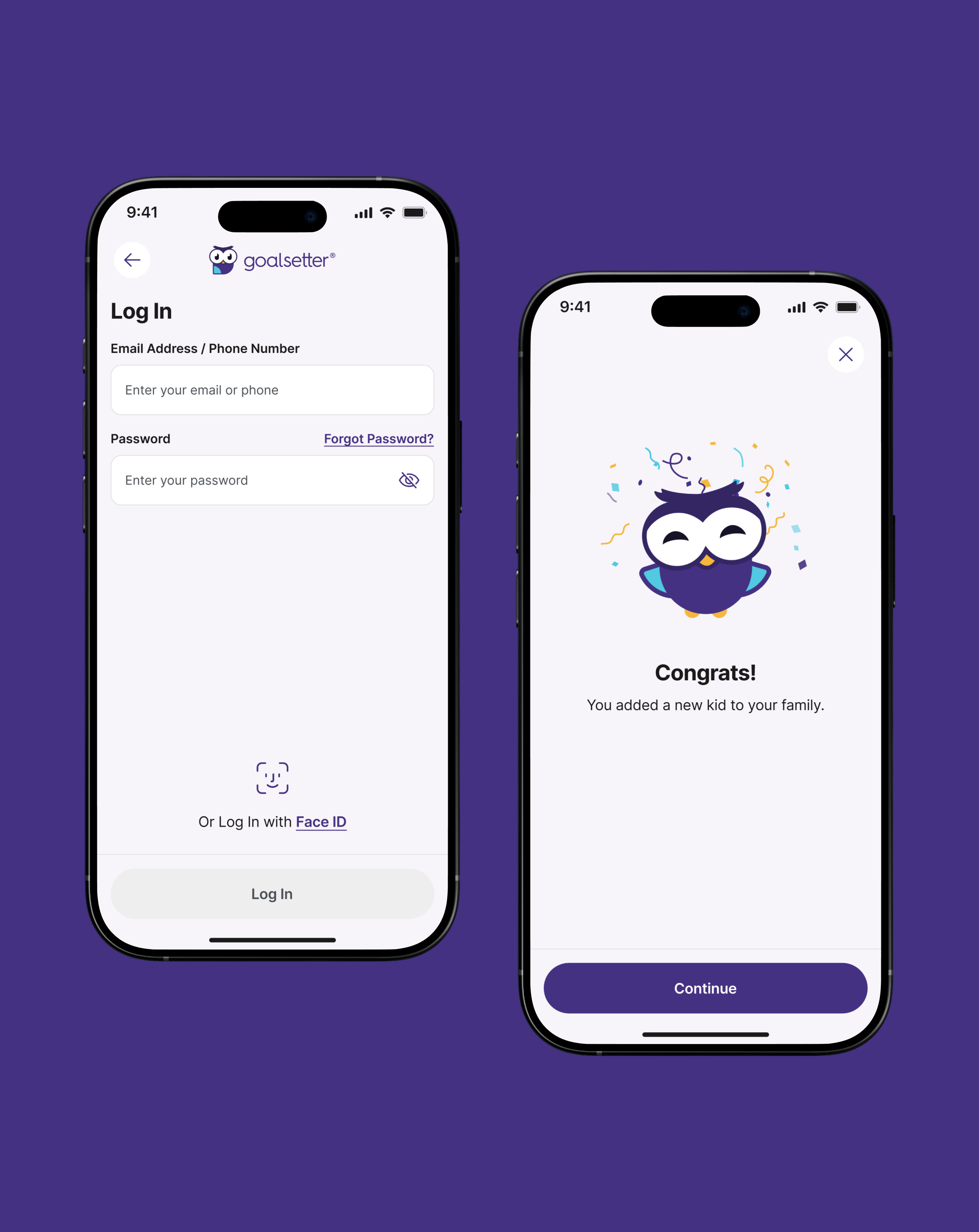
Ship with engineering, not after them. Onboarding got shorter and asked for less before the first real screen. The parent dashboard became one kid at a time, with a spendable number, the card in that same block, and Add a Kid in the profile row. Handoff included specs and accessibility notes. We kept iterating after ship, and put the system in Storybook so QA could test it there.
06
Iterate
Go back to users and engineering after ship. Measure what landed, fold the fixes into the system, and keep the library alive so the next flow starts stronger than the last.
Decisions
Key decisions.
01
Two files, not one
Design Library held tokens in variables. Components held every piece with empty, skeleton, loading, pressed, error, and pending states.
02
Apply it feature by feature
Put the system on the live app one flow at a time. No full rewrite while families were still using the product.
03
Move the system out of Figma
Storybook became the shared home for design, engineering, and QA, so the same components could be tested, reused, and shipped.
04
Use research on the main flows
We took the findings into the highest-traffic paths: shorten onboarding, and make the spendable balance and the debit card read as one account, not two.
Design system
The library, inspected.
Two Figma files. Design Library holds tokens in variables. Components holds every piece with empty, skeleton, loading, pressed, and error. This is a mini example of that system: a quick look at a few pieces. The real DS was enormous, and we cannot show it complete here.
Mini example
Goalsetter App (Design Library)
/colors · /typography · /icons
Mini example. A quick look at a few pieces, not the full system.
Color
Typography
Icons
Phosphor Regular · 24px · Weight=Regular
The outcome
The product now ships from a system.
New screens start from shared pieces, not a blank file. Parents can tell which account sits on the debit card. More families finish onboarding, and more money moves through the app. Engineering ships faster because components already exist, with the states they need, instead of inventing UI in the gap. Design and development keep a loop after release: feedback, iteration, and a library that can still grow.

Reflection
What we learned.
01
A scalable product needs a scalable system
If the design system is not planned from the start, the product pays for it later. A live app without a shared library grows one-off screens until nothing holds together.
02
The system cannot die in Figma
We can design in Figma, but then it has to move to a place like Storybook. That is how it stays scalable for design and engineering, testable, and reusable.
03
Engineering from the start, and after ship
Work with engineering from the first decisions, and keep the loop after execute. There is always something to fix. A complete handoff, with every state, is what stops them from inventing flows later.
“Lautaro is a true design system expert: he can build them from the ground up, analyze them, and adapt them to evolving needs. His knowledge of development significantly enhances collaboration with engineering teams and ensures smooth implementation.”
Next
Eden
