
Telehealth
Eden
A treatment page people could trust enough to start.
- Project scope
- UI/UX · Web
- Industry
- Telehealth
- Role
- Product Designer
- Services
- Product Design, Design Systems, UX Research

Project overview
Eden is a telehealth brand. People come to the site to understand a treatment, see if it is for them, and start a visit. Weight loss, strength, anti-aging, hair growth, mood, and more sit on the same site.
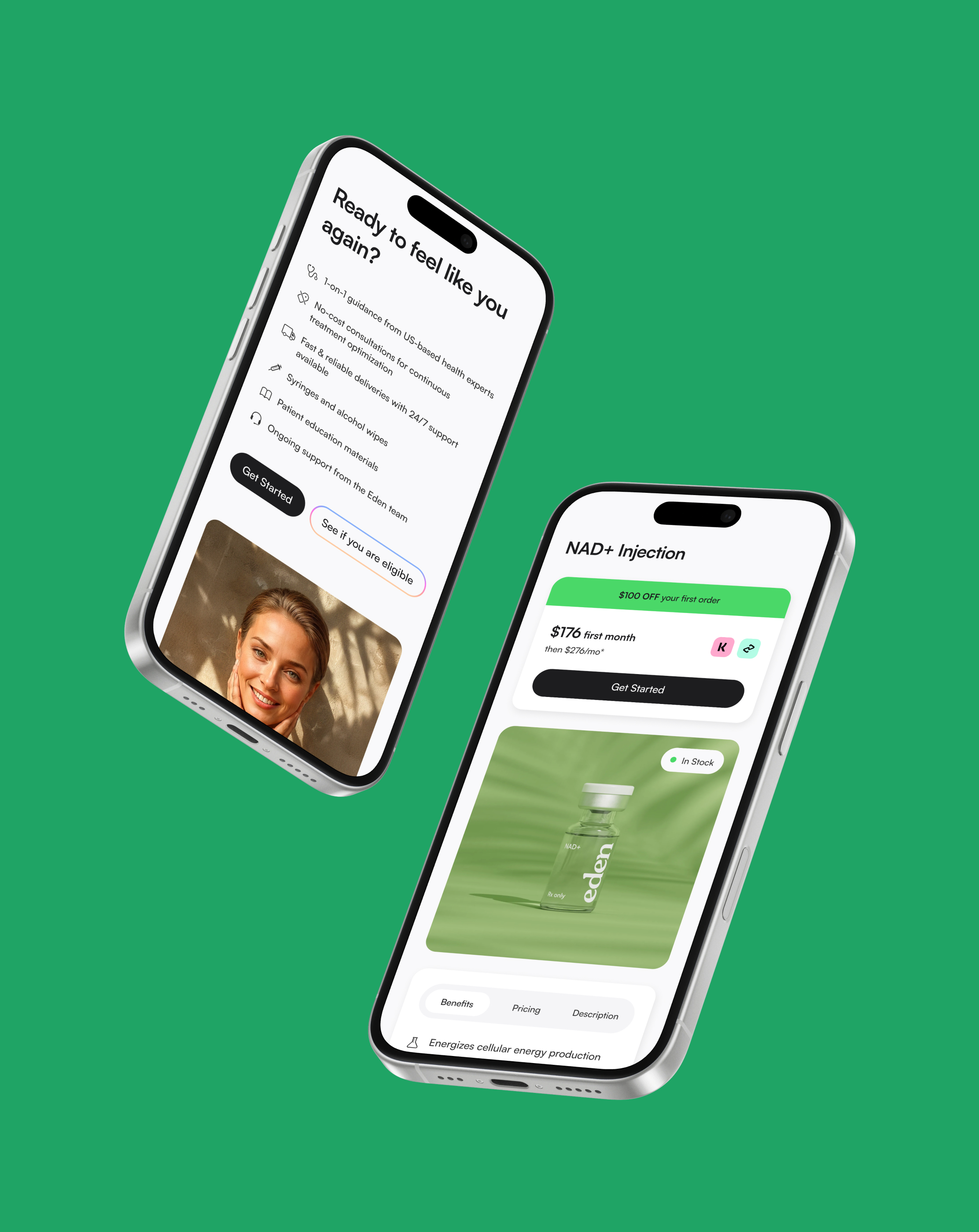
The team already had a Design Library, and the site looked right. The pain was time. Every visual change meant editing Webflow pages by hand. We turned that library into a system in Figma, moved it into Webflow, and used it to redesign the live pages. At the same time we rebuilt NAD+ Injection. The old hero sold a lifestyle. The product, how to pay, and who stood behind it sat further down. We put those answers in the first screen.
Objective
- Turn the Design Library into a system we can reuse and update in Webflow.
- Apply it page by page, without a full freeze.
- Rebuild the product page so people can see the product, know how to pay, and trust who is behind it.
Results
- +27% more people started a visit from the product page.
- -18% bounce after the hero showed the product, how to pay, and who stands behind it.
- +40% faster to update the site once the system was in Webflow.
The challenge
A library that was slow to ship, and a product page that sold a feeling.
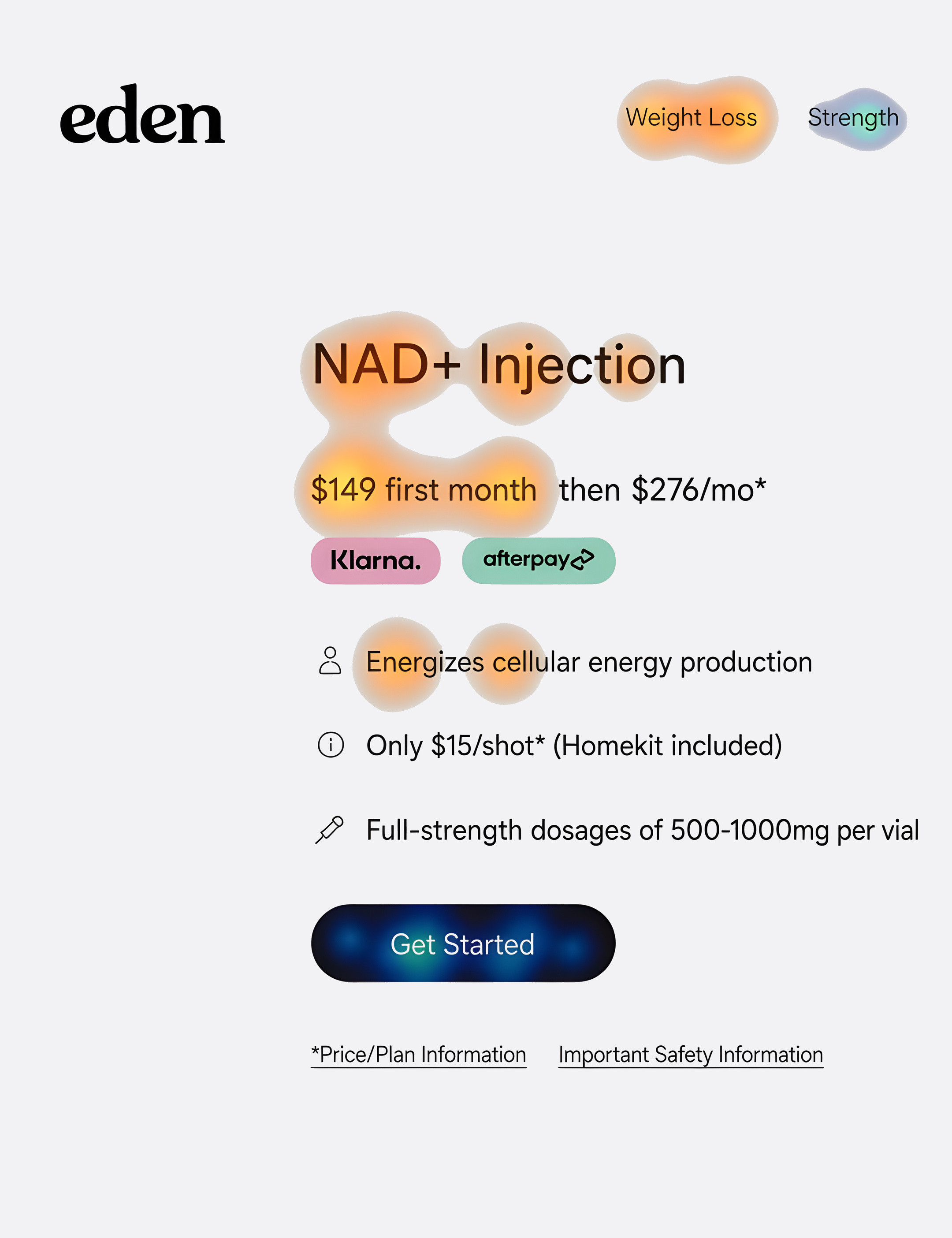
The company already had a Design Library, and the site looked like Eden. The problem was time. A change in Figma still meant editing each Webflow page by hand. On NAD+ Injection, the hero sold a lifestyle. Product photos sat further down. Price was there, but not how to pay. Three or four bullets were not a description. FSA/HSA and compliance labels were missing from the first screen. Clinicians lived on About. Two CTAs sat side by side, so some people left without coming back.
Discovery
What we heard.
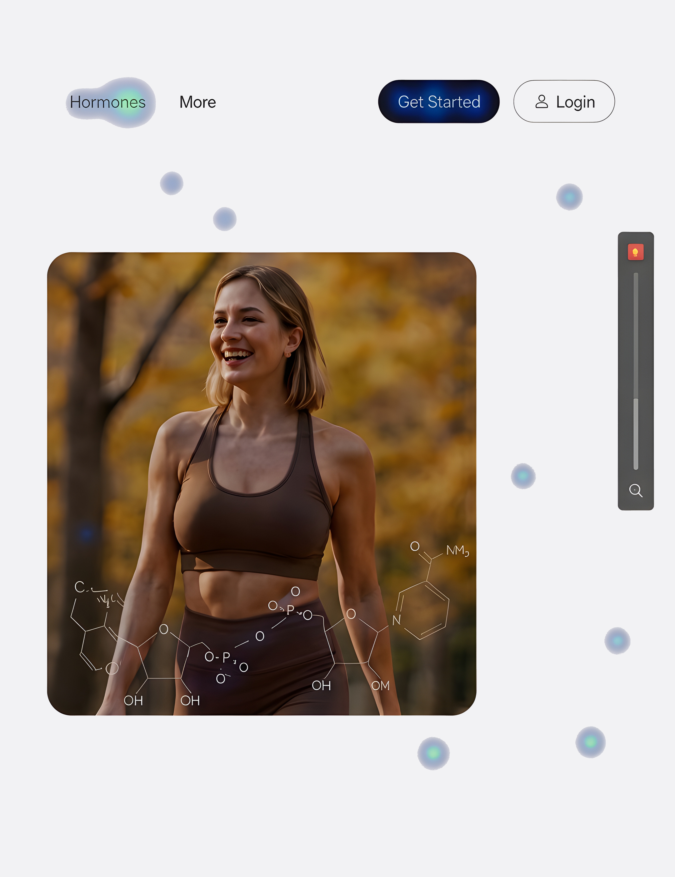
We started from research the company already had, then recorded the old product page in Hotjar. Heatmaps and session clips on desktop, tablet, and mobile. These findings did not say the site looked wrong. They said people could not tell what they were buying, and that a design change still took too long to ship.
Qualitative
The page
01
The hero sold a lifestyle. Product photos sat further down, so people bounced without knowing what NAD+ was.
02
Price was on the page. How to pay, FSA/HSA, and compliance labels were not.
03
Three or four thin bullets were not a description. Two CTAs sent people off the page.
Trust
01
Clinicians lived on About. No name or line to the patient sat next to the offer.
02
There were no FSA/HSA, in stock, or compounded in the US labels beside the price.
03
Member reviews sat far from the first decision, and they named the brand, not a clinician.
The system
01
The Design Library looked right. A change still meant editing each Webflow page by hand.
02
Price blocks, cards, and buttons were not reusable in production.
03
The team could not try a new hero on every treatment page without paying for each one twice.
Quantitative
0%
of first-screen attention on desktop sat on lifestyle photos, not the product.
0%
of mobile sessions never reached the description, how to pay, or the trust labels.
0%
of sessions left after looking for a named clinician they could not find.
Personas
New visitor
Maya
38 · Marketing manager · Opened NAD+ Injection from an energy ad
Think and feel
- I want to feel better, but I still do not know what this treatment is.
- People running on a beach does not tell me what is in the kit.
- If I cannot see a real clinician, I will not start.
See
- Ads for energy and healthy aging in her feed.
- Other clinics that show the product, FSA/HSA, and a named doctor.
Hear
- Just start a visit, it is easy.
- Make sure a real clinic is behind it.
Say and do
- She lands, scans the lifestyle photos, then looks for a doctor.
- She bounces if she cannot see the product, how to pay, or who is behind it.
Pain
- Cannot tell what she is buying from the first screen.
- Sees a price, but not how to pay or if FSA/HSA works.
- Has to leave the product page to find a clinician.
Gain
- The product in the hero, not only a lifestyle photo.
- A real description, how to pay, and FSA/HSA labels.
- Named clinicians next to the offer, plus frequent FAQs.
Ready to start
Chris
44 · Operations lead · Ready to start, checking cost and who would review his visit
Think and feel
- I already want to start. I need to know how this is billed.
- A single number is not a plan. Is that monthly or the first month?
- I will not send money until I see a named clinician and that FSA/HSA works.
See
- Clinics that show first-month price, what you pay after, and FSA/HSA.
- Named doctors with a school, a role, and a short line to the patient.
Hear
- Just tell me what I get this month.
- Can I use FSA for this?
Say and do
- He looks for payment detail and a doctor. He does not find either next to the offer.
- He clicks the secondary CTA, lands on another page, and does not come back.
Pain
- No monthly versus yearly, and no FSA/HSA next to the price.
- No named clinician on the product page.
- Two CTAs. The wrong one takes him off this treatment.
Gain
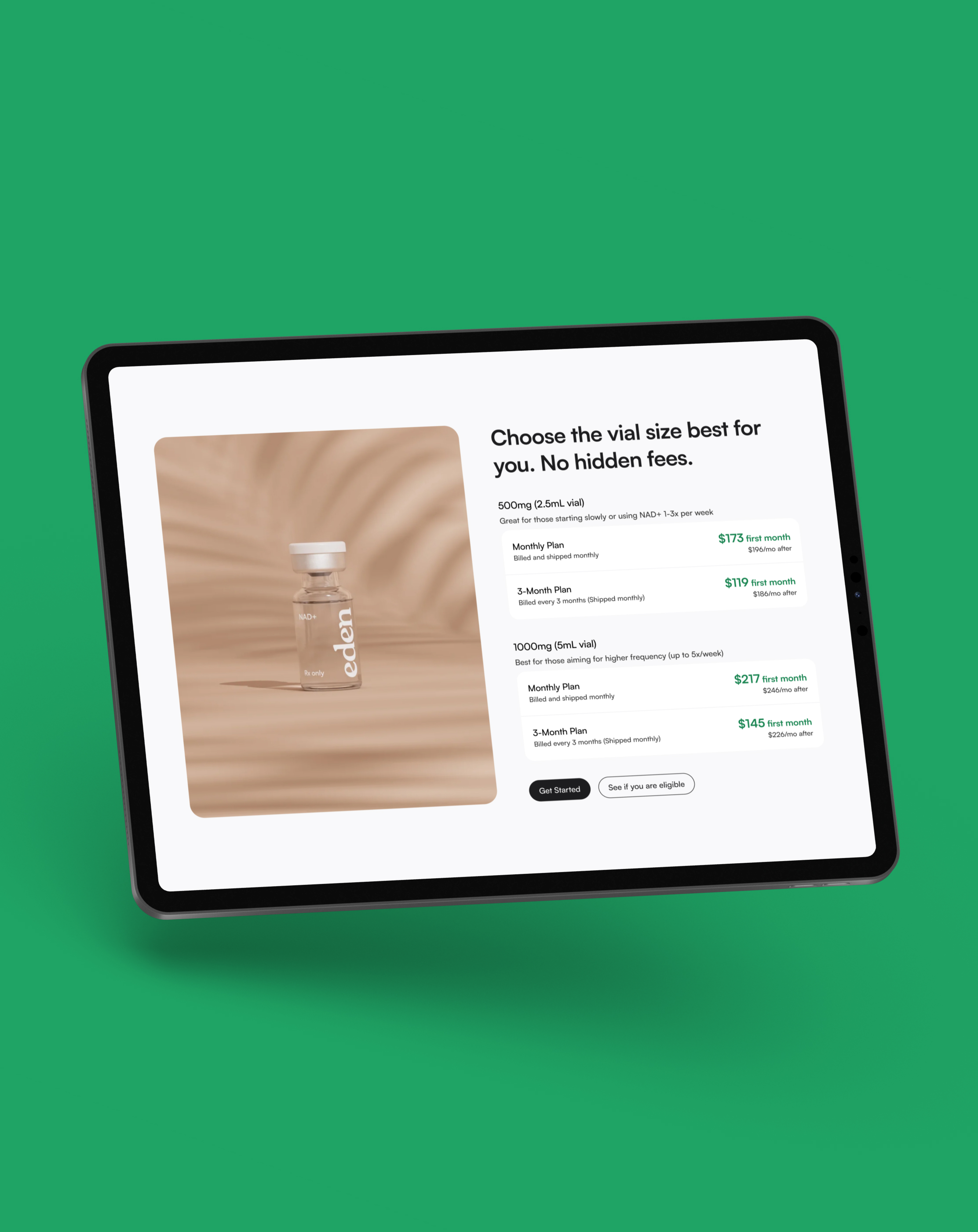
- First-month price, how to pay, and FSA/HSA next to the offer.
- A named clinician with a role and a line to the patient.
- One primary CTA that stays on this treatment.
Information architecture
Site
Home- GLP-1 Treatments
- Custom Weight Loss Kit
- Ozempic®
- Wegovy®
- Zepbound®
- Sermorelin Injections
- Sermorelin Tablets
- Vardenafil + Tadalafil
- NAD+ Injections
- NAD+ Nasal Spray
- NAD+ Face Cream
- Glutathione
- Finasteride
- Minoxidil
- GHK-Cu Foam
- Custom Hair Growth Kit
- MIC+B12
- Methylene Blue
- Hormone Therapy for Women
- Everyday+
- About Us
- Blog
- Community
- Reviews
- FAQs
Process
The approach.
Two jobs, one pass. Turn the Design Library into a system Webflow could reuse, then rebuild the product page so the first screen answers what this is, how you pay, who stands behind it, and what to do next. We started from research the company already had, then ran Hotjar on desktop, tablet, and mobile. I designed the system in Figma. A developer moved it into Webflow.
01
Set goals
Sit with design, product, and the Webflow developer. Lock two targets: a system that makes updates cheaper, and a product page that makes the treatment, the price, and the clinicians obvious before people start a visit.
02
Research
Use research the company already had, then watch the product page. Hotjar heatmaps and session clips on desktop, tablet, and mobile. Other clinics in this category put a named clinician, FSA/HSA, and reviews next to the offer. We used that as a bar, not as a template.
03
Analyze
The library was not the problem. Reuse was. On the old NAD+ page, the hero sold a feeling. The product sat further down. Price was there, but not how to pay. There were no FSA/HSA labels next to the offer. Clinicians sat on About. Two CTAs sent some people off the page.
04
Strategy
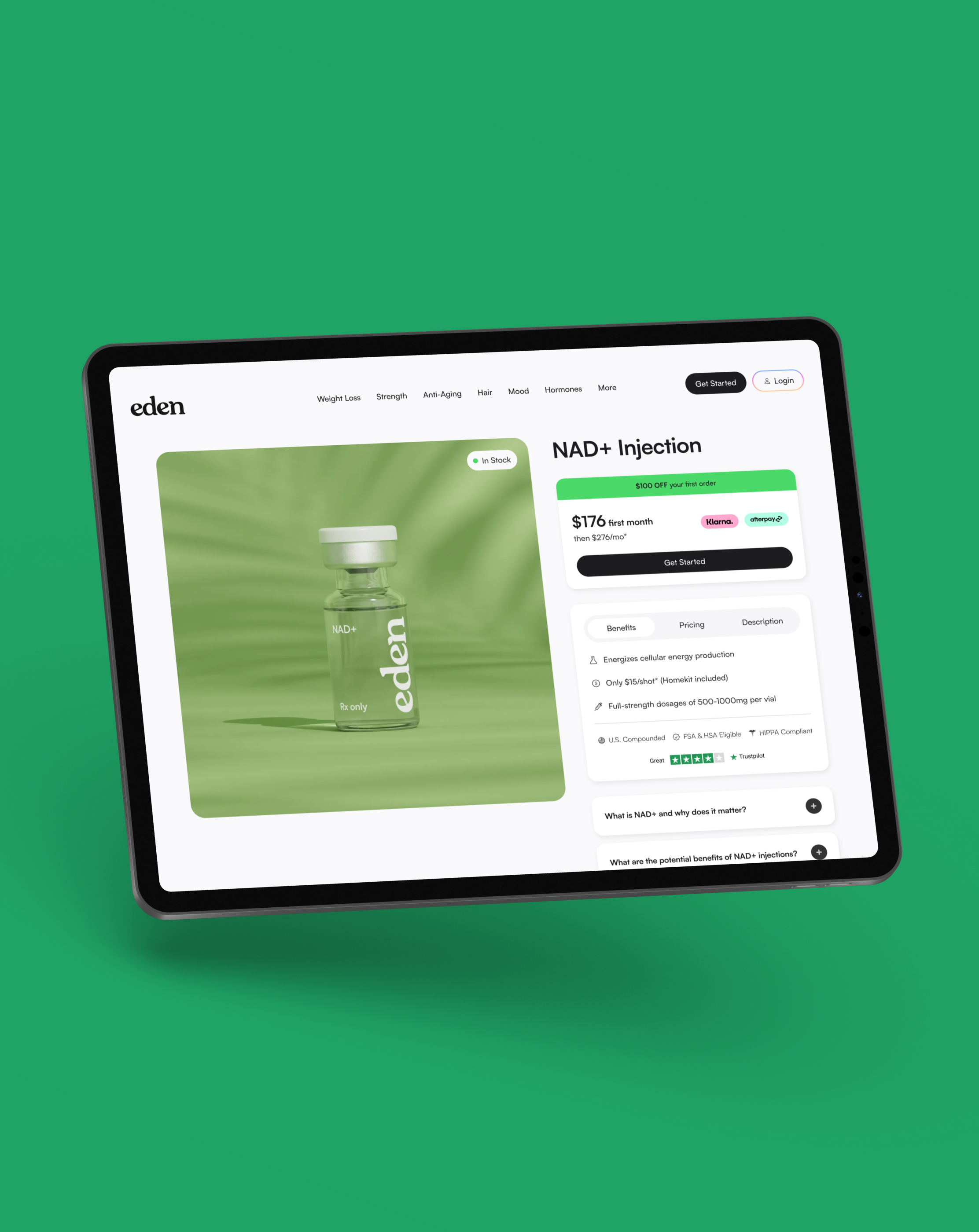
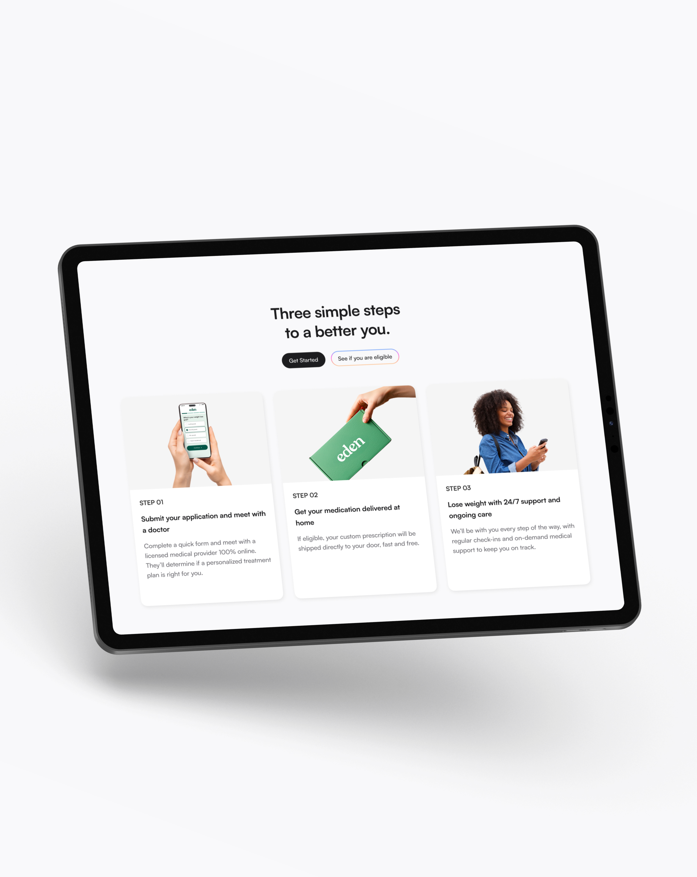
Turn the Design Library into tokens and components in Figma, then the same pieces in Webflow. Redesign Home, the treatment pages, About, Blog, and Community from those pieces. On the product page, put the product in the hero, show how to pay, move frequent FAQs up, and keep one primary CTA.
05
Execute
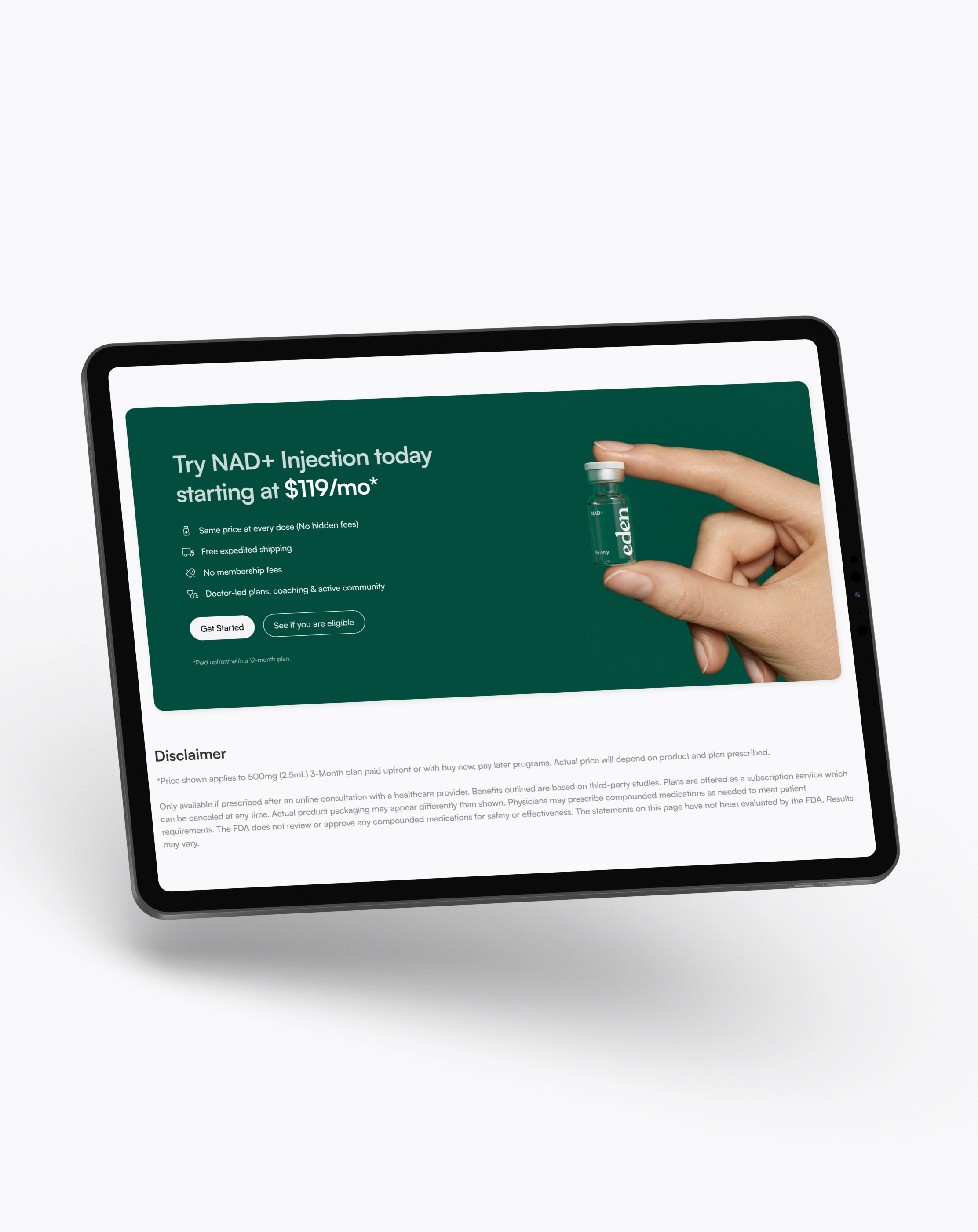
Design the system in Figma. A developer builds it in Webflow. On NAD+ Injection, the hero becomes the product: a real description, how to pay, FSA/HSA, frequent FAQs, and one primary CTA. Named clinicians sit on the page. We kept iterating after ship.
06
Iterate
Go back to heatmaps and the live page. Fold the next round of changes into the system, so a hero tweak does not mean rebuilding every treatment page by hand.
Decisions
Key decisions.
01
A system from the library they had
We did not throw away the Design Library. We turned it into tokens and components in Figma, then the same pieces in Webflow, so a change could land once.
02
Apply it page by page
Home, the treatment pages, About, Blog, and Community moved onto the system one page at a time. The live site stayed up.
03
Show the product, not only the feeling
The old hero used lifestyle photos. We moved the product into the first screen, wrote a real description, and showed how to pay. Lifestyle stayed further down.
04
Put trust next to the offer
FSA/HSA, in stock, and compounded in the US sit in the hero. A named clinician sits on the product page. One primary CTA, so people did not leave for another page.
Design system
The library, inspected.
Two Figma files. Design Library holds tokens in variables: color, type, radius, spacing. Components holds every piece with enabled, hover, and disabled. This is a mini example, not the full system.
Mini example
Eden (Design Library)
/colors · /typography · /icons
Mini example. A quick look at a few pieces, not the full system.
Color
Typography
Icons
Regular · 24px · SF Symbols set
The outcome
Updates got faster. The product page showed what you were buying.
The Design Library is now a system in Figma and in Webflow. A change can land in one place and show up across the live pages. On NAD+ Injection, the first screen now shows the product, how to pay, FSA/HSA, frequent FAQs, and one primary CTA. Named clinicians sit on the page. More people start a visit. The team can keep changing the design without paying for every page twice.

Reflection
What we learned.
01
A library is not a system until production reuses it
Eden already had a Design Library, and it looked good. It only got faster to live with when those pieces existed in Webflow.
02
Selling the feeling is not selling the product
Lifestyle photos looked on brand. Heatmaps still said people left without knowing what NAD+ was. The first screen has to show the treatment.
03
Trust has to sit next to the offer
A named clinician, FSA/HSA, and compliance labels are part of the decision, not extras for About. Two CTAs sent people off the page. One primary CTA kept them on the treatment they opened.
“Lautaro was instrumental in pushing our company out of the startup design-as-you-go chaos, and into an actual structured UX/UI environment that was both visually stunning and scalable. He helped grow our brand with care and precision every step of the way, and his incredible attention to detail and to the user's journey was highlighted in everything he did.”
Next
Playground
